Let me explain all about landing pages – what they are, how they work, their benefits, and landing page best practices. I’ll share some landing page tools with which you won’t have to build your landing page from scratch. You want to know how you can turn traffic into money? Here’s your answer!
In today’s digital world, to effectively sell your product or service, especially at scale, you have to be online. Whether you have a large company, a start-up, or a shop, you have to establish your online presence with a website. But sometimes, this alone is not enough to drive conversions. That’s when a landing page (LP) comes handy.
Landing page – definition
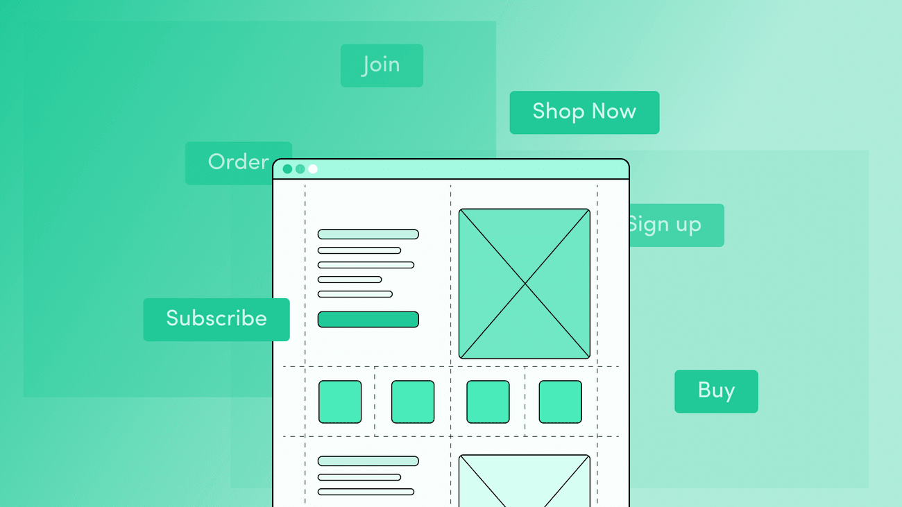
What exactly is a landing page? In contrast to a regular web page, it’s a standalone page with only one goal – conversion. Performing the desired action – such as adding a product to the cart, signing up for a webinar, or booking a demo – converts mere visitors into potential customers.
In digital marketing you can use a landing page for various reasons – gathering all content on a specific topic in one place, communicating benefits from our offer, and, most importantly – increasing the conversion rate of conducted activities. And that’s a short definition of a landing page.


Have a project in mind?
Let’s meet - book a free consultation and we’ll get back to you within 24 hrs.
The purpose of creating landing pages
Now that we have the definition of a landing page, let’s move on to its types and goals.
Generally, we can speak of two types of landing pages:
- Transactional landing pages – as the name suggests, on these pages you encourage potential customers to either buy something or use your services by leaving their contact info in the form fields (in this way, you generate leads). Hence, it may be called lead generation landing pages.
- Reference landing pages – here, you give the site visitors capsule information about your business’s product or service.
As you can see, there are different goals a landing page may have and different ways to go about it. The most important thing to remember, though, is that one landing page should always serve only one goal.
How does it work
When it comes to the contents of a landing page, it is supposed to encourage the target audience to perform a predetermined action (such as booking a demo or buying a product). Remember, though, that it’s not about you and what you want! The only way to entice your audience to convert, is to give them what they want and tell them how it will benefit them.
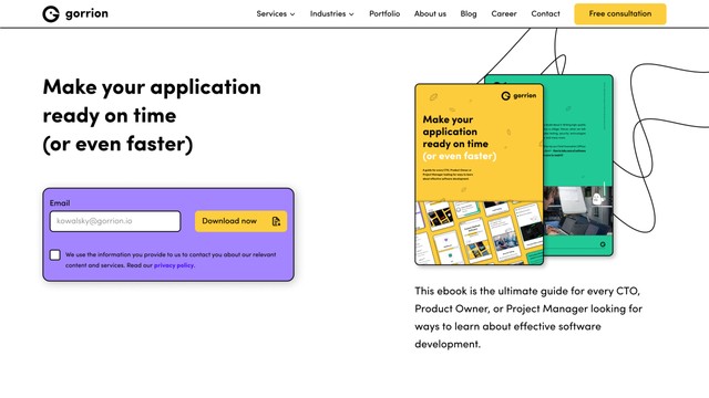
Below, you can see a landing page example from the Gorrion website.
Benefits of a well-optimized landing page
Now that we know what and how, let’s ask ourselves why should you create a landing page? Here are the two main benefits.
Improved user experience & more conversions
Because you design the landing page for a specific group, you naturally boost user experience. Why? You know your customers, and so, you can directly answer their questions, explain your product or service, and help them make an educated decision.
Creating a landing page allows you to capture the attention of the targeted visitors with your tailor-made offer. And since everything is customized, it will generate more leads, so win-win! High converting landing page.
Efficient advertising
A landing page is one of the most effective ways to advertise your products/services. Think about it – it’s easy to create, it doesn’t require much marketing effort (as opposed to other advertising activities). Plus, it’s direct, made for a specific group, and conveys a customized message. Hence, it has a better chance of keeping users from the target audience on the site, so they’ll get to know the offer better and convert more often. What’s not to like?
Landing page best practices
A great landing page should fit right into the marketing funnel, as it’s where the conversion takes place. How to achieve that, though?
Define your value proposition and stick to it
Everything starts with a plan. Creating a landing page is no different. So before you start doing anything, sit and think about your campaign. What do you want to achieve with it? Who’s your target audience? What message do you want to convey? Work out the offer, create the personas and figure out their customer journey. Then, plan the campaign.
Remember, you’re not designing the landing page for you but for your site visitors. It’s them who are supposed to perform the action, them who are looking for the answers, and they’re the ones that you help. So you should create landing pages for the target audience to fulfil their needs – not yours. That’s why, in your customized message, focus on the value proposition and convey it in all the content on your landing page.
Create a visual layout
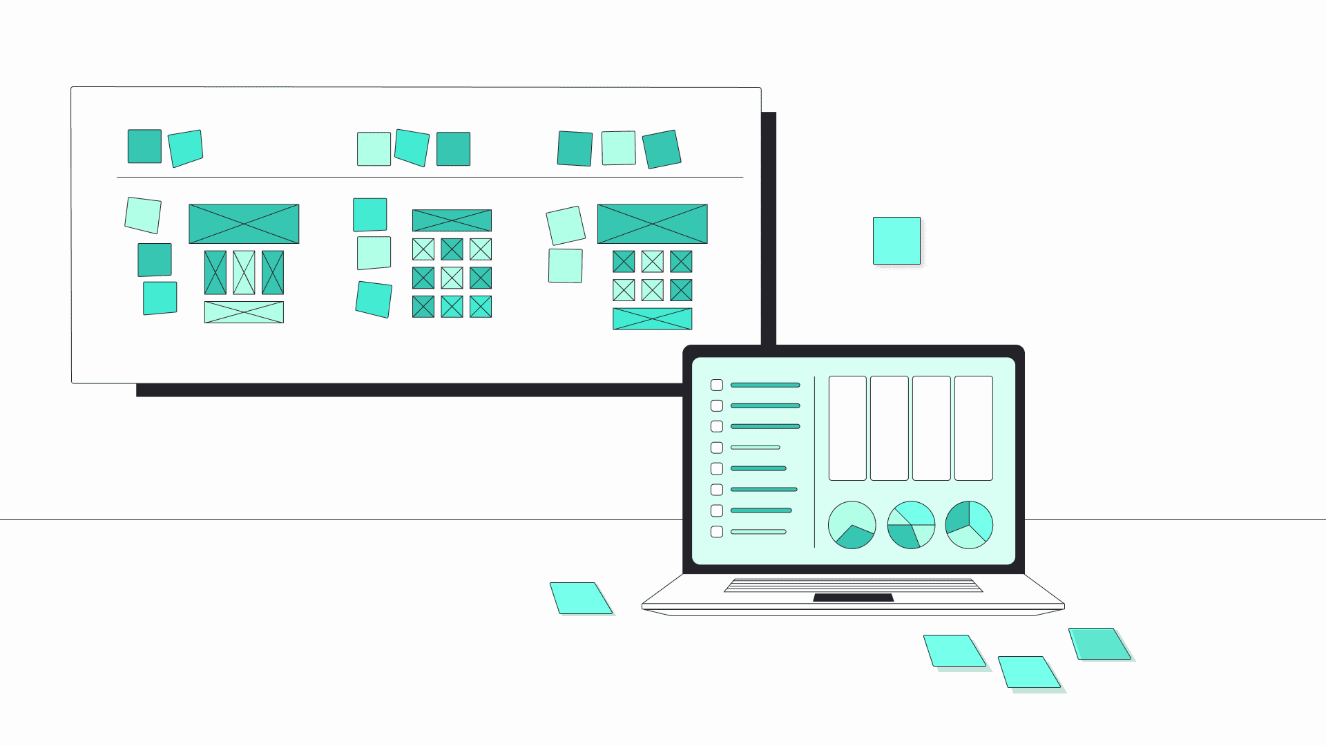
A landing page should be easy to scan at a glance. Nowadays, visitors are not really reading, as much as they’re scanning the pages (I even sometimes catch myself reading every few words). Ensure that the content is well thought out, structured, and prioritized (e.g. your call to action should always be above the fold).
Make up a convincing call-to-action
Speaking of calls to action (CTAs), they are the core of the landing page, so make sure you do them justice. There are a lot of different approaches when it comes to formulating your CTA. But it should be eye-catching and convey the message in a tone that aligns with your brand. Some prefer simple “Sign up now,” while others turn to humorous texts.
Write killer copy
As I said before, landing page content should be short, direct, and informative. Keep the visitors engaged with your copy and come up with eye-catching, yet informative headlines to draw their attention even more. Educate your audience and communicate the benefits (in bullet points, for example). Make them an irresistible offer and encourage them to pursue it. As easy as that.
Create awesome designs
Apart from excellent copy and dazzling headlines, you also need some visual elements. Illustrations, images, and videos will help you in conveying the message even better.
How do illustrations help in creating a seamless user experience? Gosia, our UX/UI designer, has written all about it.
Give social proof
Once you have the awareness and consideration stages behind you, it’s time to present your users with some testimonials from your clients (that’s the decision stage). Let your previous work speak. It can be in the form of case studies, success story videos, or even opinions taken from Google or Facebook. Because, remember, word-of-mouth always works the best.
Don’t forget about the “thank you” page
Your visitors did what you wanted them to do – clicked on the CTA and performed the action. Now what? Once you have sealed the deal, follow up with the so-called “thank you” page. It’s a great way to guide the target audience further into the conversation.
Keep it short & simple (KISS rule)
And lastly, the famous KISS rule. You should apply it here too. The landing page is doing one job only – encouraging viewers to click on the CTA and perform the action. Hence, everything on this page should be leading them to do so – compelling copy, catchy headlines, enticing visuals. That’s why simplicity is your best friend here.
Landing page tools
When creating a landing page, you read tons and tons about how to do it right – the process, tools to use, everything. And, of course, it’s all very subjective – different people may prefer one tool over the other. So here are just the 3 most popular landing page tools that I think you should look at.
HubSpot
HubSpot has it all – from marketing through sales, CMS to operations software, so of course, they offer a landing page builder. And it’s a good one. It provides an extensive library to design and A/B test each element on the page, and built-in personalization, but you can find more about it on their website.
Wix
Wix offers multiple landing page templates to choose from – new product or service, profile, “coming soon” page, and many more. Plus, they’re all customizable and easy to launch. Compared to other software, Wix is a bit limited with the use cases, but for a basic plan, why not?
Learn more about the Wix landing page.
MailChimp
Sure, they are mostly known for their killer email software. And now, they came up with a landing page builder. If you use their services, it can actually be more beneficial to use it, since it’s compatible with their campaign. Plus, they offer a drag and drop builder!
Learn more about MailChimp landing page builder.
Wrapping up
I hope this article gave you an overview of the topic of landing pages – the definition, purpose, types and benefits. So now the question is – is it for everyone? If you offer your products/services online and want to sell more, then absolutely, yes. If you want to introduce a new product, engage your audience more, invite them to your event or simply build a newsletter base, then the answer is also yes. A landing page will help you with that.
But how you design it is your choice.
You can either create it on your own by following guides like this one, or you can hire someone who does it professionally. Clients who choose the latter option, have time to take care of their businesses while the team (just like us at Gorrion) takes on the technical part of the page preparation that will ultimately help them reach their goals.


Have a project in mind?
Let’s meet - book a free consultation and we’ll get back to you within 24 hrs.
Ela writes about the fundamentals of great development, project management approaches, ways to develop a proof of concept or an MVP, UX, our company culture, and many other things happening in Gorrion.
