The foundation of every design system is a clearly defined set of principles for creating subsequent interfaces or their parts – it organizes and segregates how we want to be perceived as a brand. In this article, I’ll focus on the use of design systems in the IT industry.
What is a design system, and what are a style guide, pattern library and component library? Also, I’ll talk about the advantages of building a design system for your business and provide you with a few well-known examples.
Innovation and constant change are the signs of today’s world. This fast pace of life impacts customer’s behaviour which, in turn, influences many organizations. The evolving needs and requirements mean that businesses have to improve their processes to build products better, faster, and more efficiently. Plus, they have to be able to scale to keep up with the changes while preserving a consistent user experience.
There are two main reasons why we build a design system – the first one I already mentioned before – it’s a starting point for many businesses – to create a cohesive experience for the users so that every product is consistent with the brand. That’s an essential value which the design systems provide. The second reason is to save time on projects which are developed within the same organization. Thanks to this, the costs are lower, and the team can launch their digital product faster.
The basics of a design system
Of course, we can build a design system for our brand. For that, sometimes, we can use Atomic Design methodologies. However, it’s not a must-have here. This design system is composed of many reusable UI elements that create cohesive integrity for design purposes.
What’s a design system? If you read about this subject before, you have probably noticed that there’s no universal definition since it may take many forms and be interpreted differently. We’d define it as a set of reusable UI elements guided by standards and requirements, thanks to which specific organizations started to create their visual identity. It usually consists of several parts – components, brand guidelines, code standards, style guides, tokens and UI Kit.
This methodology is about the elements’ order and hierarchy, which, in turn, systematize design and development and adjusts it to the business particular needs. All in all, it’s to create a shared and coherent vision of a brand. A design system works as a single source, a framework and a comprehensive guide shared across the business and its employees.
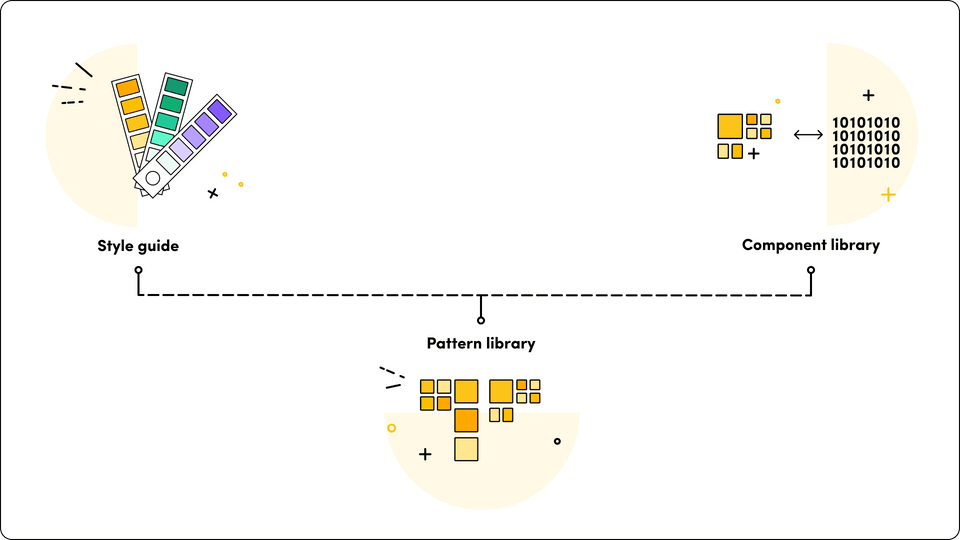
3 elements of a design system
Style guide
It gives you all the information you need about the design base, like fonts and colors and how the brand communicates with its user. Style guides usually concentrate on branding (colors typography, trademarks logos and print media) but additionally offer helpful information as to the content. Moreover, style guides can also sometimes be integrated into component libraries.
Pattern library
Here, you get UI’s graphic elements and tips on how to use a given interface. Pattern libraries contain collections of layout classes and user elements. Most have information structures, layouts and/or templates. Pattern libraries are often taken as being fewer stable than a component library, but they can be as thorough or as high-profile as required.
Component library
This is a combination of UI library and code. It ensures a smooth and effective process between designers and developers. The technical team has the code ready to use, and everybody is working with the same template. So it’s a win-win situation.


Have a project in mind?
Let’s meet - book a free consultation and we’ll get back to you within 24 hrs.
Why design systems are important
Building a design system brings many benefits, even though it surely requires a lot of work and devotion at first. The goal is to simplify life – a designer comes and already has a set of principles and design components set out. Depending on the case, we can sometimes change or add some components. But all in all, the system is figured out and forms an integrated form followed by a whole organization – design teams, developers, product owners – everybody. So what are the advantages of building a design system? Let’s see.
Shared vision
Both developers and designers accept the standard’s requirements, so there are no misunderstandings or alternate visions. The system standardizes the colours, typography, spacing, and components, such as buttons, icons, and alerts. This also impacts the workflow and facilities smooth collaboration across the organization. Moreover, the products embody the brand identity – there’s a unified experience across platforms, which makes the company more recognizable. Thanks to design systems, a whole team has shared language when it comes to a brand.
Workflow efficiency in design process
Thanks to the reusable components and already set principles and requirements, the teams know exactly how to implement the features, which, in turn, saves time and money. Also, the workflow is far more efficient, even for the new employees, since those visual elements and rules are prepared. There’s no need for developers and designers to focus on the basics because it’s already done. Instead, what matters is how the app should work along with elements specific to a given project. But, of course, not entirely. UI design is always a vital factor in software development.
Here, I believe it’s worth mentioning that there are two aspects of the design system. On the one hand, we have a design system prepared for a brand of a given company so that everyone can create new elements basing on the prepared rules and components.
On the other hand, the company can have a design system as a solution, created especially for clients who want to test their idea. When it comes to projects, you can perceive the design system as a ready-made toolbox from which you can take selected elements as they’re or alternate them to others liking. In other words, either the teams build an app without any changes or try to find a consensus between their system and the client’s brand to create a new digital product. This is a cheaper solution, but the main problem is the similarity to all other apps or websites where this system was also used.
Better UX
This point can be linked to the previous one. Because the team can now focus on features of a given app or illustration, it naturally influences user experience.
Orderly manner – pattern libraries and UI components
The system provides the designers and developers with a comprehensive and helpful guide on the components and design patterns. As a result, the products that they create represent a unified part of the company.
Source of inspiration – design principles
Creating a design system takes a lot of work and effort. It’s an iterative process involving many people, along with tons of research and tests. However, all of this pays off once you have it. What’s more, it can serve as an ideal source for others. Design system can work as a set of good practices for developers and designers – it provides valuable user experience (so why not take a look at this, right?).
Plus, it’s a pretty good marketing move. Just look at Google – they decided to step forward and show that we should learn from each other. Following this approach, they’re always up-to-date with upcoming trends, and once in a while, they release a set of good practices for developers and designers to provide a valuable user experience (so why not take a look at this, right?). Plus, Google’s design system offers great help in developing apps for the Android system, so it’s a win-win situation (users benefit from the knowledge, while more apps are created for Google Play).
Who can benefit from it?
I talked about the basics and benefits of the design system, so now let’s move on to the burning question – is it for you?
As it is in the world, not everything is for everybody. Same in the case of design system – sometimes, it just doesn’t make sense to build a whole system if you need only a few components for your platform. Of course, there are smaller and bigger frameworks, but still, it can be too much for some organizations.
That’s why bigger businesses or those with brand digital products used by many people will benefit from this system the most. They need an organized approach to patch it all together so that all the products would match and align with the brand. But again, it’s not the rule.
What about software companies?
The same goes for software houses. In this case, we don’t consider our visual communication but rather solutions for the client.
Since we base on uniqueness and customized solutions, why creating a unified framework for all the digital products? On the other hand (See? I already have ‘however’ to my point), some software houses have design systems created for clients that desire to test their idea or have a small budget. Why? If the client wants to try out the app on the market, we can offer to build the PoC or MVP using a design system, and then later, when it turns out good, customize it. Everybody benefits from it.
But what if we treat design system as…
An MVP – it’s probably ok. Because here, it’s not the question of the brand individuality. The primary goal is to check whether or not the product will appeal to the target audience. Hence, using a ready-to-use design system is our best choice.
An off-the-shelf design – sure, it’s time-efficient, but it also translates to building a set of similar apps (which can pose a problem for clients who want a unique product style).
At the end of the day, it all depends on the perks and if it’s helpful for your business. There’s no right or wrong here.
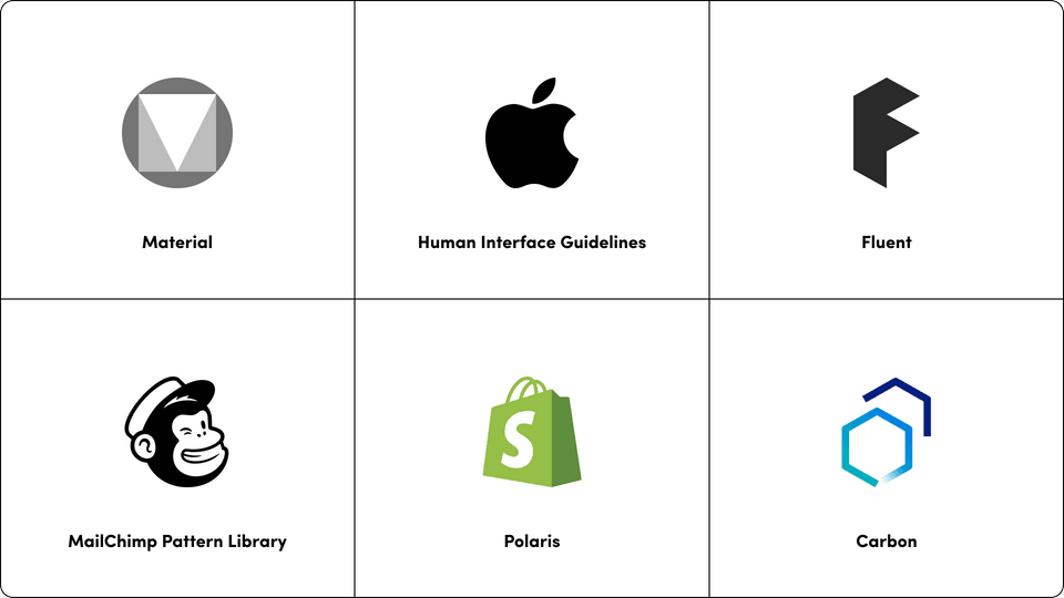
A few examples of a design system
Design systems take over the internet world. And I mean it wholeheartedly. You don’t believe it? Let’s look at these examples.
Most design systems are a source of inspiration, and some of them, created by tech giants such as Google or Apple, are a base of good practices because they’re confirmed with a lot of research and tests. This is the secret of their success – they simply work. Let’s take a look at some of the most recognized ones.
Apple’s Human Interface Guidelines
It works as a foundation for all Apple products (macOS, iOS, watchOs, tvOS). But it’s not just a design system. It also provides developers and designers with good practices and resources to create a smooth experience in the Apple world. The features of this system include user interaction, app architecture and visual index. But, as you can imagine, it’s just a tip of everything Apple offers its users.
Fluent
Fluent is Microsoft’s open-space design system for Web, Windows, Android, iOS, macOS and cross-platform. It includes features such as motion, typography and iconography. Fluent is about a natural and effortless experience across different devices that come from human diversity. What’s great is that you can contribute to improving the system by joining their Linkedin group.
Material
It’s a Google design system that provides its users with design and development resources such as material design guidelines, components, icons, design source files and many more. Like Apple, Google took one step further in creating the system – the structure and order of each categorized component are immaculate. Plus, they included Material studies for others to learn how to create user-friendly products.
Carbon
It’s a design system built by IBM for creating digital products. It provides its users with working code, interface guidelines as well as design resources. For designers, it offers design kits, tutorials to learn about and work with the system, along with resources concerning Sketch libraries, GitHub repos and many more. Developers can benefit from frameworks, Carbon tools and tutorials for Vue, React and Angular.
MailChimp Pattern Library
It’s a design system created by MailChimp – a marketing platform that helps other businesses to grow and prosper. Their philosophy centres around individuality, creativity and quality. Also, as it’s the case with other design systems, MailChimp Pattern Library gives its users a handful of innovative ideas and good practices on doing the job right. It’s mainly dedicated to industries such as marketing, strategy or, of course, emails. Its features include colour, grid system, data visualization, typography and components.
Polaris
It’s Shopify’s design system that works as a practical guide since it helps its users to create for the platform. Moreover, its features range from colours, resources, interaction states to data visualization. Shopify’s goal is to make the process as accessible and convenient as possible for everyone. They aim to help merchants in starting, growing and running their businesses.
Final words
The design system is a great way to standardize your brand uniqueness and speed up the workflow. Thanks to its organized nature, the teams can work together in unity. In addition, it provides the framework for the developers and designers, which speeds up the workflow. However, it’s not for everyone. That’s the reason why, before getting down to work, you should always think about whether or not it’ll bring value to your business.
If you have any questions concerning today’s subject, comment below. We’d love to read your insights. And if you’re curious to see what we create at Gorrion, check out our Dribbble portfolio.


Have a project in mind?
Let’s meet - book a free consultation and we’ll get back to you within 24 hrs.
He is a UX/UI Designer, Graphic Designer, and Illustrator with a Master of Arts from the University of Silesia and over a decade of experience. Influenced by the Swiss school of design and the vibrant world of pop culture, he offers a unique perspective in his work. As an avid comic book enthusiast, he skillfully combines his passion for visual storytelling with professional projects. His deep appreciation for design likely stems from his love for comics, which he enjoys as much as savoring a good cup of tea.
Other worthy reads


