


Framer Motion has gained popularity due to its intuitiveness and simplicity. Developers love it for the maintainability and designers for how the animations finally look identical in production.
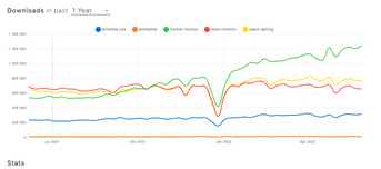
It surely is reflected by the amount of downloads it gained in comparison to other animation libraries (as you can see below).

So, in this Framer Motion tutorial, I’ll briefly explain how Framer Motion works and show you how to put knowledge into practice by building your very own motion components with animations. We’ll start from creating an animated toggle component.
What is Framer Motion?
Framer Motion is an open-source animation library known for being easy to use and maintain. One of the features of this production-ready motion library are micro-interactions. Plus, states in-between (like mounting and unmounting) are automatically covered. It’s a unique feature, not supported in other animation libraries like GSAP. It also provides 3D support.
All in all, you can create complex animations with minimal effort (and code).
Why use Framer Motion?
Physics makes animations look natural, that’s why spring animations are more intuitive compared to ease-based animations. Because of an initial velocity, spring animations do a better job at tricking our brains into thinking that something is moving, for example going from a swipe or drag to an animation after release.
Framer Motion simulates spring physics by default for physical values (x, y) and for scaling or rotating. Spring physics can also be simulated through useTransform hook.
Intuitive syntax
Framer Motion is uniquely simple, as it doesn’t require learning new, complicated syntax. All you have to do is switch regular html elements to ones with motion. prefix, for example motion.div or motion.svg. Those elements provide a variety of props, which allow you to mount animations, transitions, initial states and so on.
A variety of functionalities
Many functionalities that would take ages to implement with simple css and default listeners are provided out of the box in Framer Motion. Among the most useful ones are:
- tools for orchestrating timing of child animations:
delayChildrenandstaggerChildrenprops, which enable a delay between the first child animation and between child animations themselves, - advanced listeners, such as one for tracking scroll:
useViewportScroll, AnimatePresencecomponent which provides the ability to animate an element which is being removed from the React tree,- gesture handling, i.e. hover, tap, pan, drag.
Let’s create an animated toggle component!
We’ll be creating a thumbs up/down toggle motion component with a neutral state in the middle. The component will also change its color during the motion and will scale slightly to create a more natural effect.
For this example, we’ll start with a simple component: a circular frame, in which the paths of thumbs up or down will be drawn in the form of motion.paths. All of the icons consist of two paths to animate.
We’ll start by declaring const x = useMotionValue(0), which will basically track the x coordinate during the dragging motion.
To enable a dragging motion we’ll need to add some props to the wrapper:
The gesture is ready – the circle moves and scales during the motion. Now it’s time to draw some thumbs!
First, we need to create two useTransform hooks for the thumbs up icon – one for each path of the icon. The first parameter of this hook is what the transformation will depend on, so in our case it will be the x coordinate. The second parameter is the input range, so it determines when to transform the output. The last parameter is an output range. Both of them are a linear series of numbers, so basically an array of numbers.
Important note: output range array in useTransform hooks has to be the same length as the input range array.
Imagine an x axis. In my case its min will be -100 and its max will be 100, with our circle at 0, in the middle. To draw thumbs up while dragging the circle to the right, it would probably be a good idea to use a positive range. For a more natural animation we’ll delay it a bit by starting it at x=15 and x=20 for the other path. This will allow the animations to overlap and create an illusion of drawing the icon. The end should be at 100. The same should be done for thumbs down, but with negative values We’ll be using x=-15 and x=-10.
The last parameter is an output range, so in your case we’ll be drawing a path from none to a full one, so from 0 to 1.
That gives us four hooks:
To be assigned to four paths:
The final step is adding some colour to our toggle by creating another useTransform hook. To do that, we’ll define a range in which the colour should change, so it will be our whole range: const xInput = [-100, 0 , 100]. The output parameter is going to be an array of colours.
Now we have to pass that color to all of our paths by adding a prop: stroke={color}.
We could also add some opacity to the middle state to make room for the paths to be drawn.
const bothThumbsOpacity = useTransform(x, [-15, 0, 15], [0, 1, 0]);And the final code 🎉:
That’s it!
And there you have it! You just created your first animation with Framer Motion. But don’t stop now. As you can see, Framer Motion is a great tool to create animations in React.
If you have any questions concerning Framer Motion, reach out to me on LinkedIn!


