Sometimes you have an idea for something superb, world-changing even. But you don’t act on it. So thousands of those never realized schemes are floating in space and time, waiting to be discovered.


Medical Logistics Innovation Hub
Building future together in a cyberspace
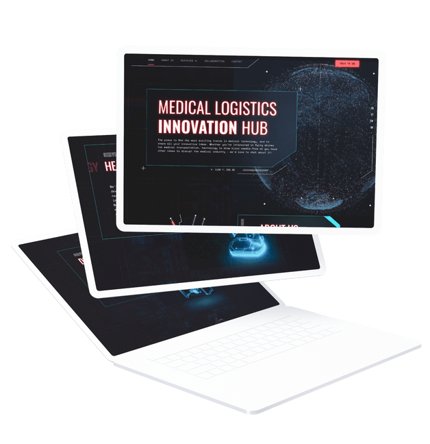
Now imagine a place to gather all those ideas and trends in medical technology and actually do something with them. It sounds great, doesn’t it? Only that this place isn’t hypothetical. Welcome to Medical Logistics Innovation Hub.
About Medical Logistics
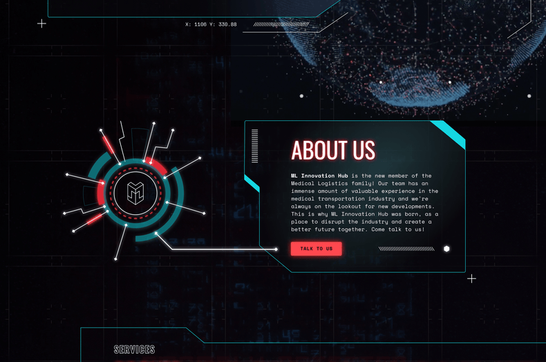
With over 10 years of experience in the medical courier industry, Medical Logistics specializes in time-critical medical transport, including deliveries and mobile phlebotomy services.
As the business grew, Alex and Tomasz, the Operations Director and Development Director, decided to create a place where various trends in medical technology meet innovative ideas. And where those cutting-edge solutions can be turned into reality. In short, they decided to disrupt the industry.
Our goal
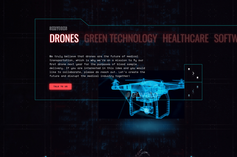
Our goal was to build a landing page. And it was going to be just as ahead of its time as the sole idea.
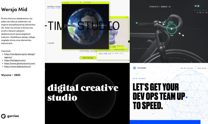
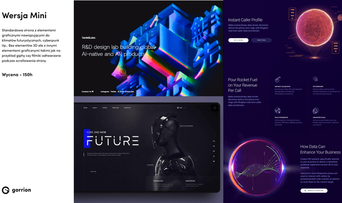
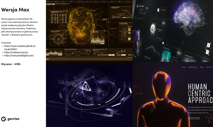
Cyber future - that was the concept. There were several inspirations from sci-fi movies and games such as Blade Runner 2049 or Cyberpunk 2077 for the page. Gosia, our UX/UI Designer, also draw inspiration from various websites with a similar style to figure out how to build the futuristic vibe with color scheme, lights, components.
From moodboards to concepts
That’s how the moodboards came to life. Then, when we knew what we were looking for and after our creative research (with the color schemes and all), Gosia created 3 possible concept styles to work out the direction.
The first one was with the glitch and undone effects, minimalistic colors. The second option, and a chosen one, was a cyberpunk vibe with piloting elements like in a spaceship. The last concept was the most extravagant, with vibrant colors, geometrical figures, and modern style.
Into reality
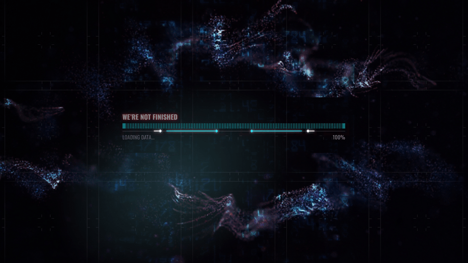
Once our client chose the concept, Gosia started designing the landing page for different resolutions. Some of its parts she did separately and animated it in Figma to show how it should look like. Just like this loading screen.
When it comes to development matters, Patryk, our Frontend Developer, built the website with React Three Fiber, which is a React renderer for three.js. It was the best library available that could provide the effect that the client expected.
For animations, Patryk used GSAP (GreenSock Animation Platform), which is a set of tools (a library) for animation that can animate practically anything. According to Patryk, it’s the best available library on the market. So he animated everything manually based on what Gosia did in Figma. Lastly, for the scroll animation, he used a plugin from the same library called ScrollTrigger.
Challenges on the way
We also carried out manual testing on various resolutions, browsers, and operating systems. That’s when the problem with scaling came up. Luckily, Patryk has figured it out developing a rather specific solution particularly for the project.
The outcome
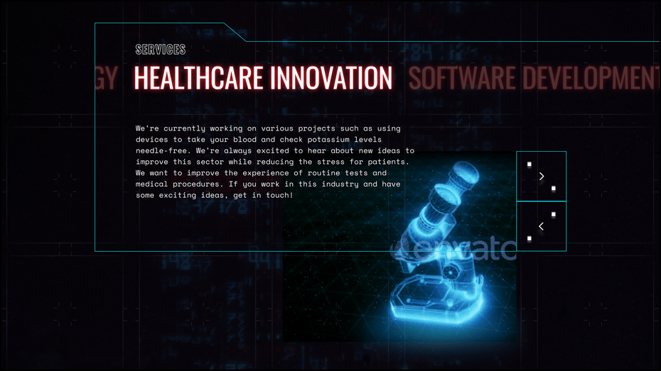
And just like that, the futuristic landing page came to life. A place where you can find out, share, and chat about cutting-edge ideas, green technology, healthcare innovation, and more. Innovation Hub - creating future together.


Have a project in mind?
Let’s meet - book a free consultation and we’ll get back to you within 24 hrs.
See other case studies

Nurokor

Savvy Quest
