

What are micro-interactions, and how do they influence digital products?
We use our phones and computers daily – for flipping through articles, swiping up on Instagram stories or texting our friends via Facebook Messenger. Most of us don’t realize that we’re engaging with micro-interactions just by performing such trivial tasks. They’re everywhere, implemented by designers, in each well-designed device, app, website and feature.
In this article, I’ll talk about micro-interactions – what are they, why are they important in this digital world and how they influence the finished product. Also, I’m going to share our experience on how UX/UI designers know when and where to implement motion to support usability and what tools we use. Also, I’ll talk a bit about our cooperation with developers.
The concept of micro-interaction
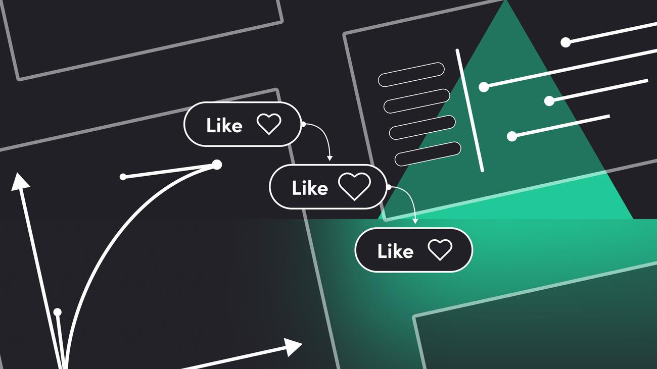
Trigger-feedback pairs called micro-interactions are used to encourage a user to interact with something, make the interaction more rewarding or keep a user informed about some action – they provide visual feedback of sort.
It’s what user sees, feels or hears – it may be a sound effect after performing some action, such as the notification sound on chat window on Messenger when we send our text, a subtle animation after double-tapping to like a picture on Instagram or a simple swipe or loading screen. Entering log user data can also be a great example of micro-interaction. These design elements serve only one purpose – to make the user experience as engaging and natural as possible.
Micro-interactions – trigger, rules, feedback, loops and modes
When should we use them? As UX/UI designers, we strive to make any interaction simple and pleasing. Hence, we may apply them in swipe action, to show current status or when a user enters log data.
Knowing that, let’s talk about its structure. There are four parts of effective micro-interactions – trigger, rules, feedback, loops and modes.
- Trigger initiates interactions with a user. It should be something visible that a user can easily interact with, such as a button. System initiated trigger should also be predictable so that every time it’s initiated by a user or system, it behaves in the same way.
- Rules define the flow of micro-interactions, so what happens once they’re triggered.
- Feedback is a result of an interaction. What’s going on in the given moment, and what changes when triggering the micro-interactions.
- Loops and Modes are used only in particular situations that disturb the normal flow of micro-interactions. Loops also have an impact on the duration of micro-interactions and their repetition.
8 rules of micro-interactions
Movement in any digital product should be natural and easy to predict by the user. Poorly done animation can quickly destroy the way we perceive the app.
On the other hand, when there’s a small, almost insignificant animation, but it’s well designed and is in the right place, it can enhance the reception of a product and guide the user to perform some action. Moreover, it can also provide the user with visual feedback after a particular activity or help prevent any errors. Hence, the guidelines on how to create effective micro-interactions. Those rules determine how those interactions should be done.
In this part of the article, I’ll discuss what we should pay attention to while building micro-interactions and provide you with useful tips so that they are well-designed and practical. What are the rules of micro-interaction?
1st rule – functionality above all
The whole point in creating micro-interactions is to minimize the gap between user expectations and experience. All their actions should feel as natural and intuitive as possible.
2nd rule – do the research
Who are the target users? What do we know about them? Collecting the data will facilitate the whole process and help in creating tailored solutions.
3rd rule – keep it simple
Overdesigning micro-interactions or adding too many of them to the website can be counterproductive. This also accounts for the animation span – it shouldn’t be too long or too short. An animation that will be too short won’t be noticed by the user, while too long may suggest that something is wrong with the given product. One way or another, it may frustrate and annoy the user rather than be helpful and enjoyable.
4th rule – make it long-term
It all gets down to one point – to make micro-interactions everlasting.
5th rule – the 12 Principles of UX in Motion
The article about designing usability with a motion by Issara Willenskomer applies to every animation, and that’s why we also add it to our micro-interactions rules list.
Read this article here.
6th rule – create harmony
It may seem obvious, but match the animations with other UI elements so that they make a whole. It’ll enhance the user experience and keep the users engaged.
7th rule – collect user feedback
Opinions from real customers can help improve the product. Listen to the target users and collect feedback. Then, evaluate what you find insightful and implement changes to upgrade and optimize the animations to work on every device. Boosting user engagement is what you’re working towards.
8th rule – speak human
Don’t make the animations too technical. Keep in mind that we’re making them for people. Thus, micro-interactions should be easy on the eye and uncomplicated, but at the same time, they should guide the user through your digital product.


Have a project in mind?
Let’s meet - book a free consultation and we’ll get back to you within 24 hrs.
The importance of micro-interaction
Now, let’s talk about why we bother about these small design elements. For us, well-designed micro-interactions distinguish unique devices and apps from ordinary ones. They not only show the user the quality of a given product but also improve its overall functioning. A micro-interaction is an incredibly efficient process that allows generating great solutions – it meets user needs in recognition and improves the UX by making the UI less machine and more human-centred.
Micro-interaction transitions add creativity to the product. Apart from loading the page, there can be many tricks to make this action more enjoyable. For example, interactions on hover – every clickable element may react somehow, but we can go a step further and make the most of it. For instance, the icon can change the colour; it can also move or bounce. It’s so simple, and yet, it makes the user experience more rewarding and makes the product more emotional.
Let’s see what are the other benefits of well-designed subtle animations, as they also:
- improve navigation within the app/website/device,
- enhance user experience and the overall quality,
- facilitate interacting with the app/website/device,
- provide instant feedback to a user about a completed action.
Our approaches to micro-interactions
Open-source animations
When there’s a lack of time or budget, we use ready-to-use, open platform animations. For this, we use LottieFiles, which is an Android, iOS, React Native and Web open platform library. It facilitated our collaboration with developers since it also acts as a plugin and allows us to export our animations from After Effects to Lottie JSON, that’s to code form. Thanks to this, the quality of the animation is much better on the website without adding extra KB.
Custom interaction design
When it comes to animations that we create, we first consult developers about our idea, if it’s doable (mostly, it’s the case of whether or not we fit into a project budget). When we get a green light, we get to work. If not, we talk it through and try to find a solution. Sometimes, we simplify the animation – the quality stays the same, but it’s easier to implement. The last stage is exporting the animation to the code form and sending it to the developer along with how it should look so that there wouldn’t be any misunderstandings.
Another way of insightful and dynamic thinking – developers’ approach
Sometimes developers create part of a micro-interaction, especially when it requires minor code changes, such as changing a colour button. There are also times when developers do all the work. We provide them with visuals, so how the animations should look like and all the necessary information, e.g., making the movement more natural. And then, by constant communication and giving feedback, we refine the animation.
Summary
As you can see, micro-interactions are everywhere, and they play a vital role in how the end-users perceive the product. A micro-interaction lets the user know what will happen, what’s happening or what happened when using the device. That’s why micro-interactions should be created with proper attention and taking into consideration all those 8 rules.
Of course, we only touched basics of the subject since there’s so much more to say about it. But our goal in this blog post was to show you their importance in every app, website, and device. For me, a product designer, the attention to detail is as significant as anything else. Thanks to well-created micro-interactions, the user experience is smooth and enjoyable. Because that’s how effective micro-interaction works – it provides instant gratification for some performed action.
Interested in our designs? Check out our Dribbble profile.
Editor’s note: We’ve originally published this post in November 2020 and updated it for comprehensiveness.


Have a project in mind?
Let’s meet - book a free consultation and we’ll get back to you within 24 hrs.
Bartosz is a senior product designer with over five years of professional experience who believes that the essence of great design lies in the details. He advocates for pixel-perfect designs and clean, simple interfaces that captivate people through subtle micro-interactions. His passion for design is complemented by his love for Indian cuisine and a keen interest in astronomy. After hours, you’ll find him hitting the gravel trails on his bike or simply enjoying a great movie.


