
Improve your digital product with usability tests – the case of Edu Bears
There are many methods of usability testing. All of them alter depending on the product, its target audience, and the budget. They aim to better determine customer situation and check whether the designed solutions suit potential users needs. Hence, designers are able to create a successful application that is also easy to use.
Created digital product, its usability, functionality and intuitiveness is largely a matter of end-user. Thus, when designing an app for children, do a live test with them! There is no better way to check whether it meets their needs as you will get a firsthand opinion which will help in ensuring customer satisfaction with the product.
Our cooperation with Edu Bears
How do we know that user testing involving kids is particularly important? It’s because we had an opportunity to conduct such tests with Edu Bears – a company that aim is to educate children using innovative solutions. These are licensed methods of learning English used by children in schools in over 400 locations in Poland, Czech Republic and Slovakia. Kids don’t get bored so easily since it’s learning through play with a variety of options.
Our job was to build an application. After we’ve come up with the right solutions for Teddy Eddie – a method for younger kids, it was time to create something for the older ones. And this is how we’ve developed Savvy Quest web and mobile application. It’s a part of Savvy Ed course which is a continuation of Teddy Eddie for children at the age of 7 to 10. Savvy Quest is the series of games, stories to listen and ebooks that take place in different worlds depending on the level of the user.
To conduct this test, Edu Bears asked some of the students to take part in it as the application was designed primarily for them. Thanks to the approach of our experts, our client, and these little heroes, we were able to test the application efficiently, in a friendly atmosphere and to get satisfying results.
Preparation stage
When it comes to the process alone, first, our team prepared a scenario. They identified all the objectives of the test, such as the questions for the participants. By doing so, they could follow the plan step-by-step and get all the necessary information. What’s interesting is that not everybody in the research team had been working on this project. This allowed us to adopt a fresh approach during preparation.
The session
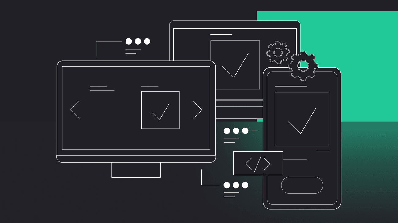
The test took part in Edu Bears’ residence. Gorrion’s team equipped the volunteers with smartphones, tablets and computers. The test was implemented in four different operating systems: Mac, iOS, Android and Windows. To get a better understanding of how kids use and perceive the application, our designers were registering the session. It included recording their voices and tracking their progression on the path. We provided one person from the research team per user. As they said, the most important thing is to observe kids behaviour and listen to their opinion. You cannot lead or criticise the user. Otherwise, you won’t get reliable results.
The test consisted of the survey and the interview. During the session, the team were asking kids about their favourite games, what they are doing during the day, their habits, how they enjoyed the designed application etc. In this way, our experts got to know users point of view and their daily routine. They used the gathered information to make the game more user-friendly to increase its playability.


Have a project in mind?
Let’s meet - book a free consultation and we’ll get back to you within 24 hrs.
Kids experience
Demanding players
When our team asked about other games they play, it turned out that children prefer more complex ones, with an open world such as Minecraft or Terraria. With rich storylines, competition, personalised characters and different worlds to explore. It shows the influence of the current game trends on young players. Also, our little volunteers made clear that they need more elements to stimulate the gameplay. Despite the young age, they had many ideas on what to add and what to improve. From a product development perspective, this information points the direction to which the application should continue to develop to make it more interesting for players.
Little geniuses
In the tested version of the game, the users collected rewards for completing each level. But the children draw our attention to the randomness of this system. They wanted to know whether the received award depends on the level they are on. It was a question that surprised our experts with its brilliance. Most likely, it resulted from the fact that nowadays, even the youngest players are accustomed to receiving a prize adapted to their level. At that time, there was no real determiner for it, but after the test designers decided to change it.
The myth of the final award
This result is probably the least expected – the myth among the player’s community. During the test, one of the participants told our designer that after reaching the final stage of the game, the user unlocks a treasure. It was not true. At that time, there was no reward for completing the game. But this information was extremely valuable as our experts could now meet the expectations of the users about the final prize.
The result
Our experts agree that children were interesting respondents full of ideas, which will contribute to the improvement of the application. The kids had a lot of fun during the session, but it didn’t stop them from making valuable suggestions about the game. The tests gave our team more information than they initially assumed. It shows that assumptions of users expectations represent the fragment of information. That is why it is vital to conduct such a usability test to update our knowledge and to make our product more suitable for its audience.
In this blog post, we’ve described only a part of our cooperation with EduBears. Here you can find out more about the project from our client’s perspective.
We’ve found that it’s worth doing the tests at every stage of application design to get an in-depth understanding of what needs to be changed or eliminated. It enables us to adapt the digital product UX/UI to the client’s expectations and make it an app that is exactly what users need.
Editor’s note: We’ve originally published this post in May 2020 and updated it for comprehensiveness.


Have a project in mind?
Let’s meet - book a free consultation and we’ll get back to you within 24 hrs.
Ela writes about the fundamentals of great development, project management approaches, ways to develop a proof of concept or an MVP, UX, our company culture, and many other things happening in Gorrion.
