


Colors are an inseparable part of UI design. They enrich the user experience, reflect the brand’s personality and convey the needed messages sometimes better than words.
Also, colors used in the digital product may impact how the users see them – comforting and friendly or maybe fast and adventurous. So how to choose, mix and match the colors in UI design? What is a color theory? And what are the principles and rules on how to do it right during the product design process?
In this article, I’ll cover all the above questions in terms of software development projects as well as the UI color palette generators and some color trivia that we gathered from our experience as UX/UI designers.
About colors – why isn’t it that easy?
On the internet, there are many articles about the psychology of colors as well as emotional color association studies. There are many theories considering how the final user perceives a given color. And no, it’s not all universal. In fact, when discussing the color-emotion associations, it’s best to do it with regard to a specific target audience in a given culture and time context.
But let’s start from the basics and take a look at this well-known color wheel palette.

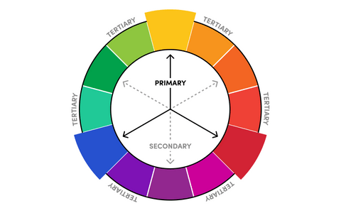
The color wheel depicts each primary secondary and tertiary color. This also lists respective color, tint, tone. Through visualizing how each color relates to the next color on a rainbow color scale allows designer to create bespoke color palettes that facilitate aesthetic harmony.
Because, after all, color is the easiest and most important aspect for engaging the user with the product in design. We can establish an atmosphere of elegance warm or tranquility by choosing the right colors in the scheme or we can convey an image of playful youthful feeling. We can create mood, attract attention or create something unusual.
The selection of color somewhat rely on color psychology, but as you’ll see later, not entirely. There are other important features that you should take into consideration when picking them.
Types of colors in projects
Before we get down to picking the colors for our color scheme, it’s best to establish our ground. What do we have? Do we start from the beginning, or maybe we already have some foundation for the project (some style guide or brand book provided by our client).
Let’s consider the second option. If we start from scratch, it’s worth thinking about the sheer choice of colors. The color categories for a project include:
- Primary colors,
- Secondary colors,
- Semantics colors,
- Tertiary (accent colors),
- Neutrals (neutral colors).
As a rule, I like to start from the primary color and then move on to complementary color. If we start from scratch, that primary color most probably will be a brand color that the target audience associates with the company we design for and/or with our main project’s area.
Have a project in mind?
Let’s meet - book a free consultation and we’ll get back to you within 24 hrs.
The gray area in the color palette
Personally, I like to start from grayscale (since every interface has its grey palette), and those grays will be my neutral colors. We can also differentiate those neutrals into desaturated colors that have no tint within them (they’re simply gray). After all, we want to imitate the colors of the real world and they’re always saturated on some level.
Hence, once we have the palette of greys, we can color it up a bit. In other words, transfer some of our brand colors into the greys. Thanks to this, everything will be much more harmonious.
And here, we can be talking about Color Relativity – a theory of how colors are perceived when they are next to other colors. If we agree on one primary color, we can implement its value to other colors, making everything consistent. But this approach may be a little risky – there’s less contrast involved so instead of looking consistent, it may look vapidly. Also, it’s worth noting that not every color will work out with grey saturation, so that really depends.
How to match secondary and accent colors – color combinations
Once we pick the dominant, primary color, it’s time to consider the secondary and accent colors (because, most probably, one color is not enough).
Here, we may apply the 6:3:1 rule that derives from graphics (and not so much from UX/UI), but it can be applied to interface design. That transfers to 60% of primary color, 30% of secondary color, and 10% for accent color. It’s the ultimate recipe for a pleasing composition and a balanced interface.
6 focus areas
As you can see, selecting colors can be hard. There are a lot of different factors that we should consider so that color scheme would convey the right message. So how to do it right? Well, when selecting colors, it’s worth paying attention to these 6 distinct areas. Let’s check them out.
Culture
In different cultures, the same colors may have different associations. Let’s take a look at the color red – in Europe or North America, it symbolizes love and passion, whereas, in South Africa, red is a symbol of violence and sacrifice.
Context
When we’re rebranding some website/app, we usually make sure that the new look somehow refers to the older version. In this way, the target audience won’t be confused with the change. Below you can see the case of our website.


Target audience
The same goes for the target audience. Factors such as age and culture in which a given target audience grows up greatly impact how particular color is perceived by them. So pay attention to that.
For example, when we worked for Edu Bears, an educational app for kids, we turned to warm hues to make the app more friendly and welcoming for the young users.
Accessibility before anything
When discussing accessibility, the relation/contrast between color and text is also important, especially when creating a button or a background. In fact, color contrast is one of the most vital elements when selecting a color (when we’re talking about it in relation to text or with other colors). Without considering it, we can end up with hard-to-read elements.
Here, Web Content Accessibility Guidelines (WCAG) is a must. Learn more about the WCAG standard and W3C process with the WCAG overview.
Dark mode
When creating color schemes for the project, we always think about the target audience. So once we decide on the light mode in the app (based on personas or due to budget limit), we only make the light mode of the app. But if we later want to “add” the dark mode, then, well, we’ll have to re-do the app all over again. Why? The color that may look good in light mode may be too contrasting on the dark mode. And so, we won’t adjust the color for both modes at the push because, let’s be honest, the chances of us succeeding with a whole palette would be close to zero. All in all, the dark mode has its own laws.
Even if we don’t assume that dark mode will be one of the features in the project, it’s still worth considering it. To test the colors on both light and dark backgrounds and see how they perform. After all, you never know whether or not your user has turned on the dark mode on their device.
Also, it’s a very common approach to create a second color palette just for the dark mode. In that way, the colors are less saturated.
Screen quality matters
Creating designs for specific devices or screens, I’m also mindful of saturation. Why? How something is perceived can be much different because the colors may look totally different. The screens are contrasting (even though the color value is identical). Some screens have retinas, and others don’t so make sure to check that.
Tools for creating color schemes
How to pick the right colors for our color schemes? We can always do it manually and by checking the color wheel, pick the color by one side and the exactly opposite one – these are the complementary pairs (it works almost every time).
Or we can use tools that will allow us to choose the rest of the colors. Based on the universal color principles, they’ll help us create a color harmony.
What about variations of the same color?
When designing a color scheme, it’s also worth creating a few alterations of the colors. For example, when we have primary, secondary and tertiary color, it’s worth making brighter and darker variations (these also called tint and shade) for each of those colors.
However, in UI design, there’s a rule – the less, the better. So focus on max 3 tone variations. In other words, once we have a primarly colors, we can make 3 tints and 3 shades of it, so in total we have already 7 colors. Even if we don’t use it all, it’s better to be prepared for such ne ed (because you never know). Here, the contrast between the tones is also extremely vital.
But how to do it? How to create such a hierarchy around just one color? I wondered that for a long time, and then it came to me – I can do it with math. To do it simply, we need to convert our colours to the HSL colour spectrum. H=hue, S=saturation, L=luminance. To create lighter and darker (tints and shades) variations, we simply need to modify the L value. Adding to the original L value will create a tint (brighter variation), whereas subtracting from the L value will create a shade. To ensure those colour variations are different enough from each other, a good rule of thumb is to add and subtract by 10.
There are special generators that choose a color scheme based on the Bezier curve. Here, every color has its place in the color gamut. One of such color scheme generators is ColorBox by Lyft Design or Material by Google.
Key Takeaways
- Start with grayscale,
- Follow the 6:3:1 rule,
- Believe in nature,
- Avoid blindly following the psychology of colors. It’s more than that,
- Pay attention to accessibility and saturation,
- Save time with ready-made tools.
Final thoughts
As you can see, colors matter in user interface design. They can evoke emotions, cater to users’ needs and, most of all, help us create a beautiful user experience.
And with following a few rules, such as the ones that contrasting colors should be used for accents, while warm and cool colors must be balanced, you’ll be one step closer to creating a harmonious color scheme.
Looking for some design inspiration? Check out our Dribbble profile.
Have a project in mind?
Let’s meet - book a free consultation and we’ll get back to you within 24 hrs.
Bartosz is a senior product designer with over five years of professional experience who believes that the essence of great design lies in the details. He advocates for pixel-perfect designs and clean, simple interfaces that captivate people through subtle micro-interactions. His passion for design is complemented by his love for Indian cuisine and a keen interest in astronomy. After hours, you’ll find him hitting the gravel trails on his bike or simply enjoying a great movie.
Other worthy reads


