
Create a seamless user experience with illustrations
Illustrations have become the inseparable elements of user interfaces. And it’s no surprise, since they provide users with easily accessed information and deliver the brand vision, while evoking an emotional connection with the target audience. Plus, these UI elements can visually show complex ideas in the simplest way. And they’re aesthetically pleasing, so what’s not to like?
Nowadays, more and more companies decide to use illustrations than photos. Coincidence? Not really. They do it all to effectively communicate with their customers via infographics, brand heroes, onboarding tutorials and many more, which is another purpose of illustrations. But more about it later.
What’s the role of the illustrations in user experience (UX)? How can they enhance UX in mobile apps and websites? Also, what are the top 3 incoming trends for design? I’ll answer all of those questions and more. So, what do you say? Let’s see how custom illustrations can transform UX design.
User Interface illustrations – is it a must-have skill for every UI designer?
“Do I have to know how to draw illustrations?” – it’s a common question in the UX design world asked by those who just start their journey with user experience (UX). And the answer is no, you don’t. At least, not necessarily.
Drawing illustrations is one of the abilities you can have (as another quality), but it’s not a must-have. There are many open-source UI toolkits and component libraries with various graphic elements, so I’m sure that every designer will find something appealing to their illustration style. In short, there’s no need for custom graphics – you can get away with it.
On the other hand, when you do know how to create illustrations or maybe it’s even your hobby (like in my case), it’s great to be able to use it at work. For me, a task in which I have to make illustrations is something truly enjoyable.


Have a project in mind?
Let’s meet - book a free consultation and we’ll get back to you within 24 hrs.
What’s an illustration if not solely a visual element?
That’s a trick question, obviously. Did you know that the word “illustration” comes from Latin and means “to light up“? So, if you think about it, this is the exact purpose of illustration – to visually communicate an idea that comes from the text and make it more understandable. Clever right? They’re these interesting visual metaphors to engage users and create positive user experience.
Also, as a complementary element of a copy, each illustration tells a story. Because of that, it has to be tested by the end-users during usability tests – to make sure that it’ll be received as it should be.
Get more insights on how to improve your digital product with usability tests.
Benefits of illustrations
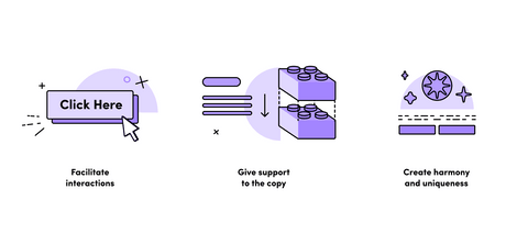
Facilitate interactions
Illustrations lead the users through the onboarding process – introducing new features, tutorials, and gratification. Thanks to this, the whole experience is much simpler and effortless.
Give support to the copy
As I said before, by adding illustrations to the content, the designers enhance the text and make it more accessible. As a result, it’s easier to read and quicker to digest, making it a much more enjoyable experience.
Evoke emotions
And at the same time, this visual metaphor has also an emotional appeal – it builds trust with approachable and simple illustrations. Since illustrations are much easier to take in, it’s also easier for them to evoke emotions that make people connect with the brand.
Create brand identity & awareness
Illustrations are a great way to raise brand awareness. Because of unique illustrations that form a whole – the organization is much more recognizable since the audience automatically associates the style with the brand.
Create harmony & uniqueness
The same goes for the sense of harmony. Once we know the theme of a given organization, it’s easier for us to use other products from them. We know their message, we like it – why not?
When illustrations improve UX
How a seemingly functional element can come in handy in creative projects? Let’s see how UI design enhance the way users interact. Are you ready?
Onboarding
There are few places in the user interface where UI illustrations play their part perfectly. For example, during onboarding, where they lead users through a given project. Starting from entering log user data to introducing the target audience to an uncommon functionality.
Plus, they quickly transfer the information, since they act as a visual interpretation of a text. But not only that. Because illustrations serve as a visual appeal guide, they’re naturally engaging users, which, in turn, creates a memorable experience with a product. Thanks to this, users know exactly what’s going on and how to perform a certain action – it prevents any misunderstandings or wrong associations with product and provides a pleasant user experience.
Tutorials & tooltips
Just like in the case of onboarding, illustrations are great tools for tutorials. Often, they work as a support for textual instruction or a visual representation of a text. One way or another, they definietly have explanatory potential – they’re easier to understand and quicker to remember thanks to visual elements in the interface design.
Product features
Especially the new ones that appear when using the app. UI illustrations work as visual triggers to catch the user’s attention and prevent the customer from closing the pop-up window.
Entertainment & aesthetic
A simple illustration has a significant power in other aspects too. It strengthens UI aesthetics, because – let’s be real, people like pretty things. Especially in today’s world, we have much shorter attention, and we like to go through text, any text (blog articles, emails, anything) quickly – in short, we’re skim readers. That’s why illustrations are so vital – they combine the aesthetic satisfaction with visual data presented in a fun way. What’s better than that? Also, this type of visual design is much more universal than text. Hence, it can be used many times and there’s no expiration date on it.
Rewards & gamification
Illustrations are also great interactive elements to reward users. Creating fun badges for completing some process or finishing a task encourages the users to use the product more. The same is with gamification – this design technique makes the whole user experience much more interactive and memorable by setting challenges, keeping scores, grant badges or stickers. Here, the illustrations are once again very useful.
Brand experience (theme & mood of the web or mobile apps)
Illustrations are also extremely useful in growing brand awareness and form a general stylistic concept. From a single illustration, you can get the general theme and mood of digital products. Thanks to this, product designers can work out an original style of a brand, which has significant impact on the entire experience and recognition of an organization. This also stimulates users’ imagination since it allows them to get an idea of the brand’s audience.
Empty states of user interfaces
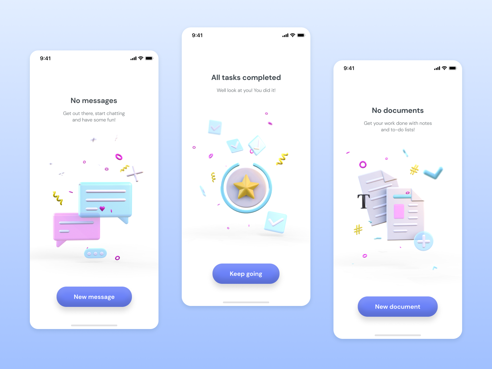
Empty states are moments in UX where there is nothing to display. For example, on the screen space, there are yet no messages, or no notes have been made. You can leave it like that, of course. But, for me, empty states are a chance to provide the users with an enjoyable experience while conveying meaning. Just like in this case.
Illustrations in user experience as a part of branding
We can also include illustrations in branding and create a brand hero (just like in our case, with our little sparrow) that guides you through interactions, shows you new functionalities, informs you about cookies on the page, and many more.
As you can see, there are many ways in which we can apply illustrations. They’re present in user interfaces during onboarding and in empty states as a way of expressing what will soon appear there. All in all, I think I proved how valuable they’re for the seamless user experience. So what else can they give us?
Top 3 illustration trends
Now that we know all about illustration, let’s talk about the future of design – what can we expect here?
3D design
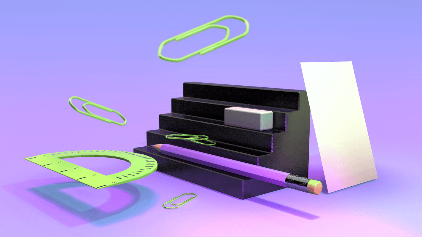
There are many predictions, but one thing is for sure – 3d design is going to be the main theme of the design world. And it’s already visible in the available tools that give you templates, 3d models and textured materials from which you can create your innovative designs.
Take a look at the 3D illustrations that I did with Vectary (and I loved it).
Vectary is a 3D and Augmented Reality design platform that allows you to create all the illustrations from your browser. It’s that easy.
For more illustrations like that, check out my Dribbble profile (yes, you guess it. I did more than one shot).
Optical Illusion Design
Having fun with typography is also another big trend that’s coming up. Similarly to 3D designs, you get to flow with your imagination. Optical illusion, atypical animated typography, oddly-stretched letters – in short, this trend makes everything in its power to hypnotize you. Let the letter pull you into their reality.
Diversity & body positive design
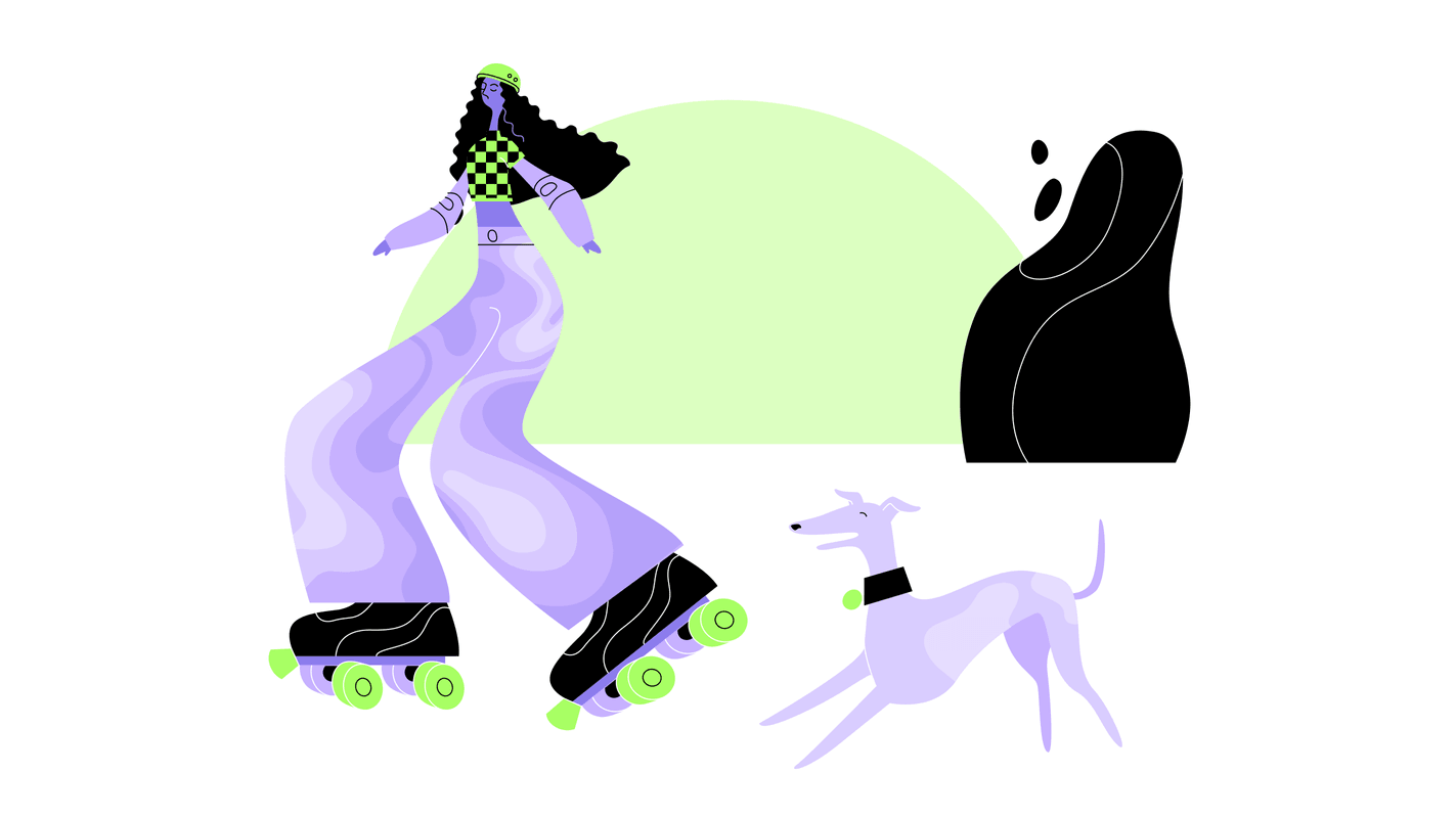
It’s no secret that society affects everything around us, including designs. Right now, it’s doing it with the body positivity movement and boosting awareness of different cultures, ethnicities, races. Hence, I present my third top choice for the future of design – a trend called “odd bodies”. It’s all about diversity and body positive image, regardless of race, gender, or size.
The illustrations show body types with unusual or even exaggerated proportions, various colours with imperfections. Thanks to that, the creators give us a wider representation of diversity in illustration. And it’s only going to get bigger.
Takeaways
I think we can all agree that illustrations are truly unique. They enhance the user experience by making it more personal and much simpler (so user-friendly), while also turn complex idea into something much more manageable. Plus, they catch the audience’s attention and signalize the brand’s vision. That makes them perfect for UX design.
And with the ongoing trends, the illustration takes many forms, so they surely will be something for everyone. All in all, the main point is this – add illustration to mobile interfaces, blog posts, system messages, it’ll boost your UX.


Have a project in mind?
Let’s meet - book a free consultation and we’ll get back to you within 24 hrs.
Designing icons from scratch, creating great UX, and other design insights are brought to you by Małgorzata in her articles.
Other worthy reads
